
Your audience is everywhere, and reaching them means streaming across screens of all shapes and sizes. Live production teams now face the same challenge social teams have fought for years: one graphic doesn’t fit every channel. Your team has to design each one for every screen format it’s going on.
That means rebuilding your graphics package for 16:9, 9:16, 4:3, and on and on (we know venue screens come in every shape imaginable). We built Spark Resize to leverage AI and take that extra work off your team’s plate, so producing those secondary streams can move from “we can’t” to “we’re on it.”
Need this ASAP? Jump ahead:
The cost of saying yes
A graphics package for a show can hold anywhere from a handful of templates to upwards of 20. Adapt each one to two new formats and you’re looking at 40 variants. At a conservative 30 to 90 minutes per template, that’s days of repetitive, error-prone work while you race against a deadline.
That math has historically left production teams with three options:
- Rebuild every graphic by hand. Copy the template, change the canvas, and move every element manually while the deadline creeps closer.
- Jam a landscape graphic into a vertical stream. The graphic gets cropped or distorted, audiences notice, and your brand standards take a hit.
- Skip the channel. Secondary streams simply don’t happen, or valuable screen real estate goes without graphics.
Meet Tagboard’s Spark Resize: a fourth option.
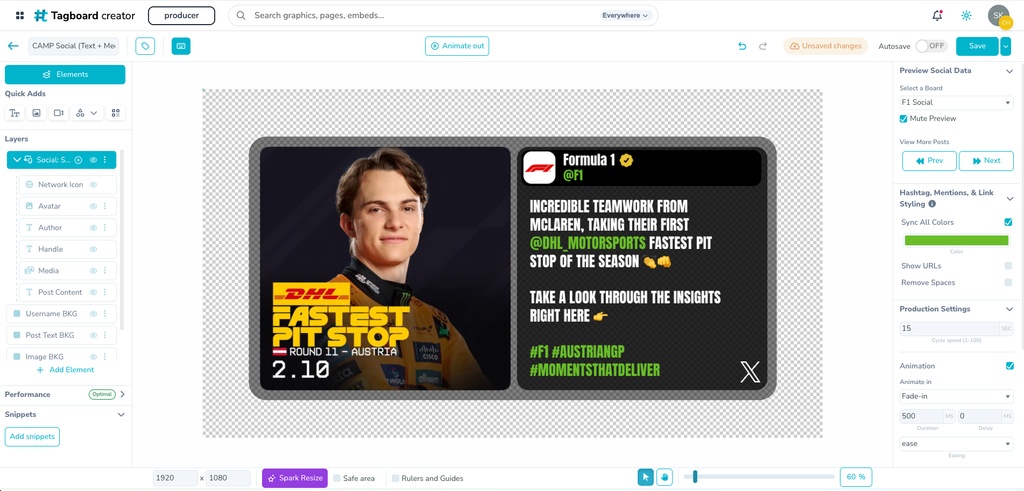
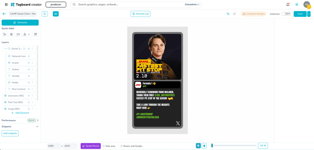
Spark Resize, now in beta, is AI-assisted technology that takes an existing graphic and produces a new version optimized for the aspect ratio and screen resolution you need. It repositions and resizes what’s already in your design, so you get a new, editable template instead of a blank canvas to rebuild.
For example: Take a 1920×1080 full-screen graphic powered by automated sports data. Spark Resize turns it into a 1440×1080 version for your video board, or a 1080×1920 vertical version for your postgame stream on TikTok and IG Live, with the data still live.
Spark Resize changes the math and turns previously unrealistic content requests into drafts you can finish in minutes. And that isn’t just more content. It’s bigger audiences, and the revenue opportunity that comes with them.
The evidence for streaming across more channels is hard to ignore. At the 24th Annual PHXAM event, Transition Productions ran a 9:16 secondary livestream alongside their traditional broadcast. The vertical TikTok livestream drew 3x the peak concurrent viewers and 3x the total viewership of their horizontal YouTube stream and set their highest viewership of any PHXAM event.
How it works
Tagboard’s Spark Resize lives inside the graphic builder.
- Select the graphic you want to resize.
- Set the new aspect ratio or screen resolution.
- Provide design context or instructions if you want to, such as “stack the media on top of the post text in this social post.”
- Review the resized graphic and make any final tweaks before you go live.
Spark Resize works fast, as you can see in the video above. But you don’t have to wait for it. Close out, work on something else, and come back to the resized graphic when you’re ready to make final adjustments.
Key benefits
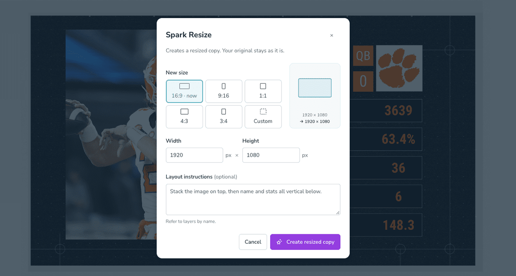
- You stay in control of your creative: Add design context and instructions up front, then take full editable control of the result. Spark Resize repositions and resizes elements that already exist. It won’t create new elements or delete any part of your design. If it gets you most of the way there, you can finish any final tweaks in minutes, not hours.
- Broadcast-aware intelligence: We designed Spark Resize around how broadcast teams build graphics. It understands the difference between an overlay and a full-screen design, so a lower third stays a lower third. It respects layer hierarchy, on-screen safe zones, and legibility for viewers. When a landscape layout goes portrait, side-by-side elements can stack vertically, and grouped elements stay grouped.
- Brand guidelines stay intact: Logos scale uniformly and never distort. Tagboard’s Spark Resize preserves your custom fonts, brand colors, and animations.
- Live data stays live: Every social, sports data, and Google Sheets data mapping carries over exactly as you designed it.
- Your original stays safe: Tagboard’s Spark Resize creates a new graphic template and leaves your source template untouched.
Say yes to more content across more channels
Your team isn’t short on ideas. They’re short on hours in a day. Tagboard’s Spark Resize gives those hours back, so you can spend them on the show instead of the rebuild.
Tagboard’s Spark Resize is now in beta and available to all customers. Read the Knowledge Base article to get started, try it on your next graphics package, and tell us what you think. Not a customer yet? Request a demo and we’ll show you how it works.